More People: The Cost of South Bend’s Decline
This is the introduction to an article and podcast series by Joe Molnar titled More People: How South Bend Lost 50,000 People in 50 Years. Joe is a proud 4th generation son of South Bend.
Read the original series: Introduction | One | Two | Three | Four | Five | Six | Seven
Read the census recap: Introduction | One | Two
Subscribe to the podcast: Apple | Spotify | Google | Stitcher | TuneIn
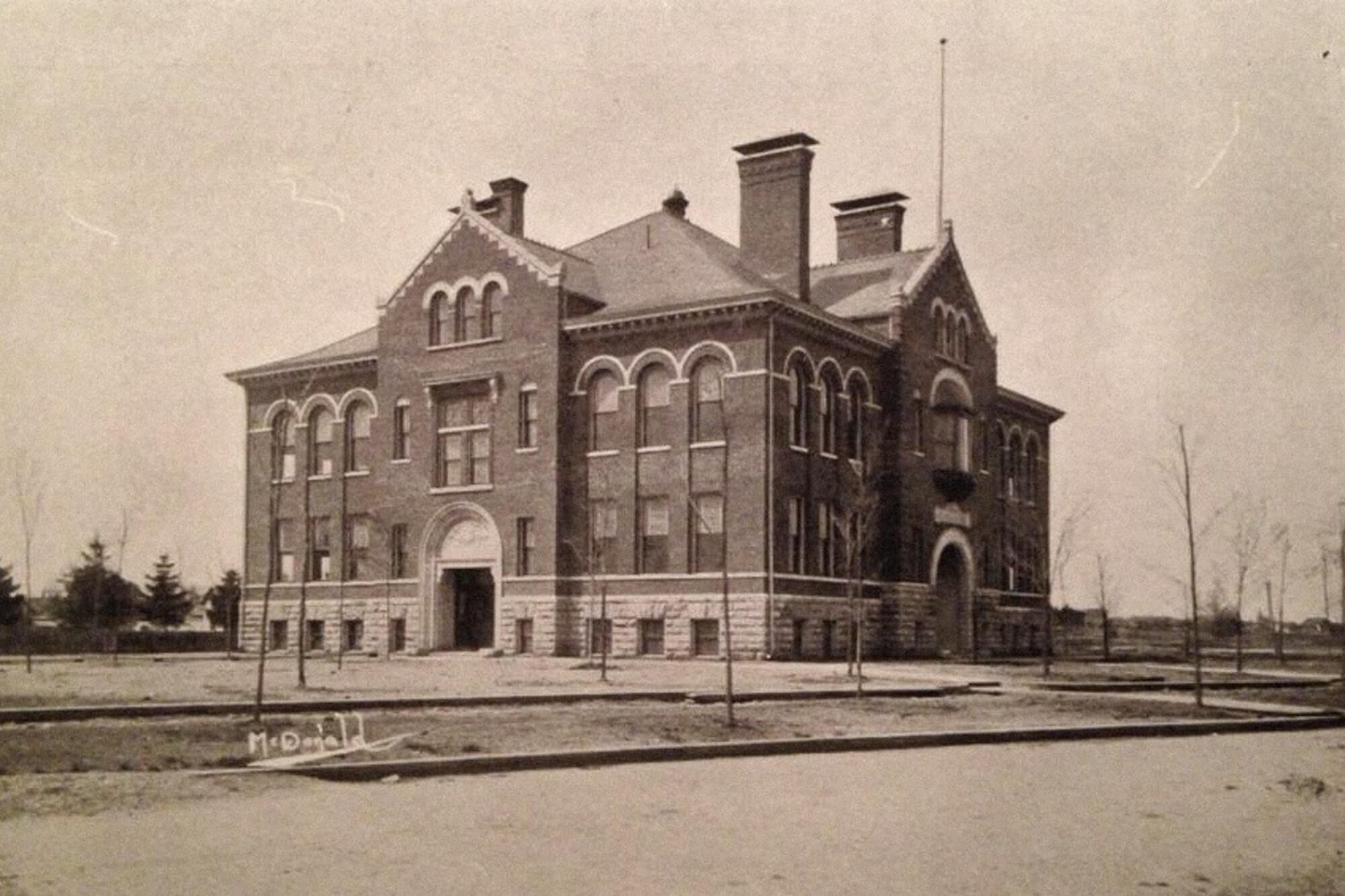
The former Colfax School on Lincoln Way West in South Bend, built 1898. Today, the building is a cultural center hosting activities from arts to social services.
A few days ago, I spent some time walking the Near Westside of South Bend, the ancestral Molnar neighborhood. The house my grandfather grew up in the early 20th century is gone and an empty field remains.
A century ago, this neighborhood looked drastically different. There were no empty fields back then. The homes which once stood housed – by today’s standards – extremely large families and children would have been present everywhere. A block away, a large Catholic church stood, dominating the neighborhood the way church steeples still do in small European villages. My grandfather would have gone to that church, but St. Stephen’s Church is gone today as well. In short, there were simply more people back then and more of the physical trappings that come with those people.
There is very little left of the fabric and life my grandfather experienced in early 20th century South Bend. More People has attempted to describe how and why this massive depopulation occurred. What has been absent from the narrative so far is an accounting of why this study matters. What is the true cost of our decline?
The vacant field on Napier Street where my grandfather’s childhood home once stood.
The answer can be found in my grandfather’s old neighborhood.
One common assumption many have when discussing population decline in Rust Belt cities is that these streets, blocks, and neighborhoods are uninhabited, that the past degraded these neighborhoods to the point of being unlivable. While many people today think of these neighborhoods as empty wastelands, it’s not true. South Bend is still home to 100,000 residents and a large percentage of those residents today live in neighborhoods in a similar situation as my grandfather’s. Our neighborhoods hit hardest by decline still have thousands of residents going about their lives and making their way in the world every single day. While I may see a vacant field and think of what had once been, that very same field is part of the current neighborhood where residents still live.
People still call my grandfather’s old neighborhood home. It is not a memory of what had been, but it’s their present and likely their future.
When I was out walking the neighborhood, signs of vivid and active life were all around me. Kids played tag. The smell of freshly grilled food blanketed the air. In most respects, life was being lived just as it had for the past 150 years. The neighborhood is still civically attached to and connected to the city and larger world. I counted at least twenty houses with political yard signs in just two short blocks. Demographic and economic forces, both global and hyper-local, have contributed to the decline of population in this neighborhood, but it is easy to be lost in the doom and gloom of statistics.
Yet, this is not to say that there have not been drastic negative consequences for this neighborhood, many others like it, and the city of South Bend as a whole. A smaller population – and the wealth that left with the people – has ultimately resulted in neighborhoods with higher crime, worse roads, depopulated schools, increased segregation, less political representation, decreased economic opportunities, and a worse climate. This is the ultimate cost of population decline. The consequences of people and wealth leaving a community are felt by those who – through choice and sometimes without choice – remain.
It is not my long-past grandfather who suffers because his childhood neighborhood faced depopulation and disinvestment; it is those who live there today. We should study this impact not to understand our past, but to realize the impact of that past on the present.
In summation of the previous articles, South Bend’s population declined because of the following reasons:
Smaller household size left many intact neighborhoods with 20-30% less people overall, but South Bend hasn’t lost that many households overall from its peak.
Suburbanization of St. Joseph County pulled almost exclusively white residents out of South Bend in the early post-World War II era. Nearly all new household creation in St. Joseph County happened outside of the primary city.
South Bend was blocked from annexing these newly created suburbs, which resulted in essentially intone city split into different political boundaries.
The decline and closure of manufacturing giants such as Studebaker, Bendix, Oliver Plow, Drewry’s, and many others upended local labor markets and caused the entirety of St. Joseph County to grow much more slowly. This slower growth reduced the opportunities for South Bend to expand, too.
Racist housing restrictions and laws – such as redlining and the Federal Housing Authority refusing to guarantee loans to integrated neighborhoods, among many others – prevented banks and other institutions from investing in South Bend’s older and largely black neighborhoods over the course of decades.
Long-term disinvestment in heavily minority neighborhoods left them ripe for the type of housing-induced economic crash experienced in the Great Recession. South Bend’s vacant and abandoned houses doubled in a just a few years, decimating neighborhoods which had been on the brink of financial viability.
There is, of course, more to the story than just those six points. But taken in their totality, they caused the majority of South Bend’s population decline in the previous half century.
What were the costs of this population collapse? Why does this story matter? That’s an even larger and more difficult question to answer. In this piece, we will explore some – but certainly not all – of the costs that population decline has inflicted onto South Bend. These costs reflect both the consequence of St. Joseph County population growth slowing as a whole and the inner demographic movements within the county which left South Bend a loser and other parts of the county as winners.
Cost One: School Quality
When I was growing up, my mom would tell me if you want to have a polite conversation in public, do not bring up politics, religion, or schools. Even as a child, I understood why politics and religion could become a divisive topic, but I was dumbfounded why schools were lumped together with the other two. Weren’t schools just where kids learned? My mother was right, of course, and I’ve come to learn that the topic of schools combines politics, religion, race relations, economics, and, of course, child rearing all into one volatile mixture. I say this as a note, and you may disagree with what follows regarding how schooling has impacted South Bend population decline. That’s okay.
Throughout the publication of More People, one lingering response has claimed that the quality of schools participated in South Bend’s population decline. These claims should be taken very seriously. When discussing the suburbanization of St. Joseph County in Part Two, I said the following:
As South Bend and other cities across the country integrated their school systems in the 1970s, the easiest way to ensure your child would not go to an integrated school was to move to the suburbs and leave the school district. South Bend was home to 95% of the African American population of St. Joseph County in 1970. If you wanted to live in a neighborhood that would guarantee your child would go to a “good” (read white) school, then you left the South Bend School District.
I stand by that statement, although some caveats need to be addressed. Since the 1970s, we have seen an explosion of population growth in the Penn-Harris-Madison School Corporation, specifically in Granger, with most of the housing value explicitly stated as the quality of the school district.
For example, see the below listings found on the real estate website, Zillow, for properties on the market today in the Penn-Harris-Madison School Corporation:
1. Stunning updated two story brick home on the water in beautiful Fox Chase! Located in the award winning PHM School District.
2. Wonderful Immaculate 5 Bedroom Home Nestled on a Cul-de-Sac lot w Gorgeous Parklike Back Yd and Super Sized Deck! Located in Fountain Blue Award Winning Penn School System and only Steps away to Northpoint Elementary.
3. Desirable Covington Shores! Blue ribbon winning Northpoint elementary school, Discovery middle school and Penn high school.
4. Spectacular home in desirable Sussex Point on a large corner lot in Northpointe. Penn School District!
5. Entertainers Dream House! Stunning two story home nestled on the water in prestigious Quail Ridge South located in Penn School District.
All five listings from Zillow identify the Penn-Harris-Madison School Corporation as one of the primary reasons to buy any of these homes. The school district is mentioned before the number of bedrooms, bathrooms, type of kitchen, or neighborhood amenities. Schools play a massive role in our real estate market and, likewise, the real estate market has direct implications on population movement, growth, and decline.
While the South Bend Community School Corporation (SBCSC) might not have the same prestige as the Penn-Harris-Madison School Corporation, I believe these schools did not have as large an impact on South Bend’s population decline, even though today they serve as a major barrier to future growth. Why? The answer is Clay Township.
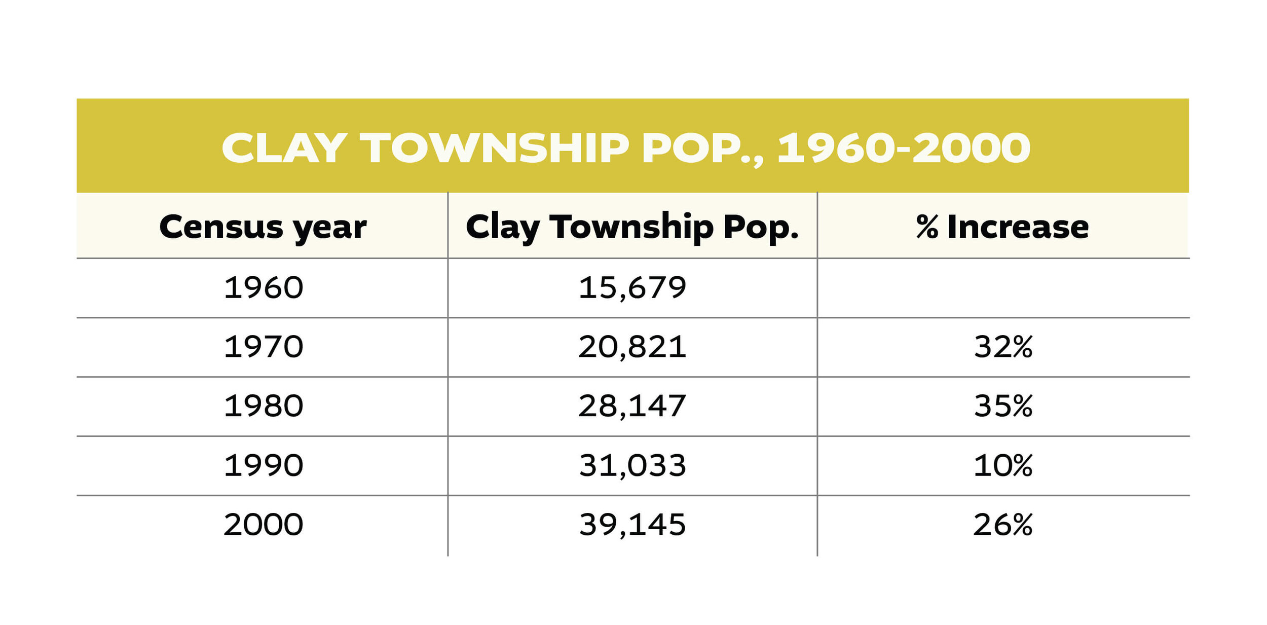
As mentioned in previous articles, Clay Township fought tooth and nail to remain unincorporated from the City of South Bend and, as a result, most of the residential properties in Clay Township today are still unincorporated. However, in 1962, Clay Township – and four other nearby townships – did merge with School City of South Bend. Even as a part of SBCSC, Clay Township still experienced rapid suburban population growth in the second half of the 20th century following this merger. The chart below tracks Clay Township’s population of from 1960 to 2000, during the height of suburbanization.
Like Clay Township, all the “collar townships” surrounding the inner city of South Bend grew for decades despite being in the SBCSC. Furthermore, under a 1980 Consent Decree, SBCSC were officially “desegregated” and monitored by the U.S. Department of Justice.¹
The Consent Decree was the School Board’s legal promise to desegregate SBCSC. The politics and history behind the Consent Decree are wrought with multiple court cases and other political complications, but for the sake of our population analysis, neither joining SBCSC in 1962, nor the integration of those schools beginning in 1981 prevented population growth of the suburban “collar townships” ringing South Bend’s inner city neighborhoods. If being in a “bad” school district did not end growth in Clay Township during this time, why should we suspect it did so within the city limits?
With this data in mind, declining school quality, in my opinion, is a consequence of population decline rather than a cause of decline. So what really is the cost of population decline regarding South Bend’s school system? Let’s start with the most obvious.
South Bend Tribune headline from Oct. 13, 2020. Another possible closure announcement in a litany of closures over the past half century.
If a city has fewer residents, usually fewer children are enrolled in school system. As school enrollment declined in South Bend, multiple schools closed and less revenue was available for the remaining children. As a result, on average, South Bend over time couldn’t afford to pay its teachers the same wages, supply the same technology resources, or provide the same educational opportunities as the neighboring school districts.
However, the type of population decline South Bend experienced has been even more harmful for school enrollment than what you would think on initial inspection. As South Bend’s household size declined – largely the result of families having fewer children – school enrollment shrinks even faster than the general population.
Imagine a neighborhood with 100 houses that send all their children to the same neighborhood school. According to the 1960 census, South Bend’s average household size was 3.2 people per house. You can roughly infer than that this neighborhood of 100 houses would have about 120 children present. Now, say the household size drops to 2.5 people (near South Bend’s average today). You can roughly infer that the same neighborhood only has about 50 children, despite having the same number of occupied houses feeding into the school. A decline of 66% despite every single house remaining occupied. These are just rough numbers that don’t include single-family parent households. However, it would be hard to find a situation where the average household size declined significantly but the number of school-age children remained flat.
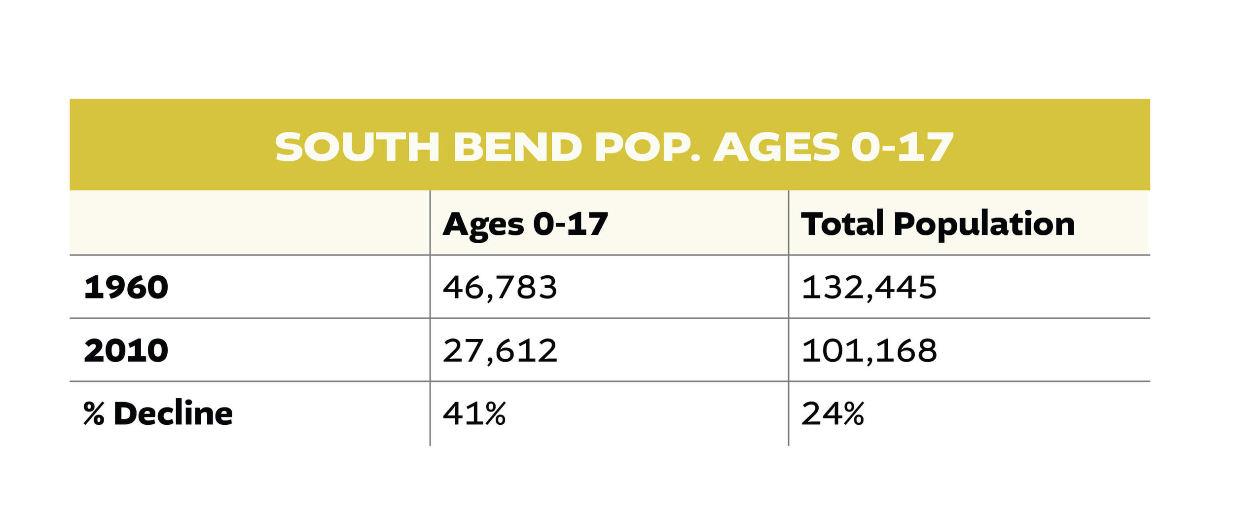
The fact that South Bend’s decrease in household size is a product of families having fewer children can be proven through data. In 1960, there were 46,783 people 17 years or younger in the South Bend city limits. In 2010, that number dropped to 27,612. This is a drop of 41%, compared to the city’s overall population loss of 24%. In fact, about two-thirds of all population loss from 1960 to 2010 can be attributed to declining population of residents 17 years of age or younger.
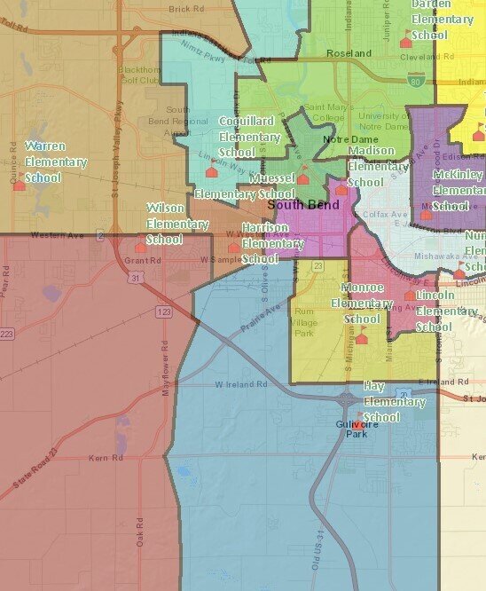
Fewer children in South Bend has had devastating consequences on our schools. The two maps below, the first from 1963 and the second from this year, show the drastic reduction of SBCSC elementary schools over six decades.
1963 elementary schools boundaries in the newly formed South Bend Community School Corporation.
South Bend Community School Corporation 2020 elementary school boundaries.
Declining enrollment due to population decline and the suburbanization of St. Joseph County made fewer resources available for the SBCSC. Additionally, Indiana State policies such as vouchers and “school choice” further reduced enrollment and revenue beyond what simple demographic decline would have caused, resulting in fewer children attending the SBCSC who were from families higher up on the socio-economic ladder. Instead the school system today is made up largely from the less fortunate parts of the South Bend community, which leads to many of the problems the SBCSC is facing.
This declining enrollment has led to a massive closure of schools since 1963. At the time, there are at least 43 elementary and middle schools in SBCSC. Today, that number stands at 21 with the possibility of more closures on the way. The closure of schools has outpaced the decline in population.
Furthermore, while areas such as Clay Township continued to grow despite being in the SBCSC, Harris Township, which is in the Penn-Harris-Madison School District referenced above, has grown faster than Clay Township. While Clay Township grew by 250% from 1960 to 2000, Harris Township grew by an astounding 873%. One of the primary differences between the two townships – which border each other and have somewhat similar suburban housing stock especially where the two townships meet – are which schools their children attend.
As the above real estate listings attest, being in a premier school district helps drive property values upward and places demand on housing in those areas. While the Clay Township data demonstrate that being a part of the SBCSC does not necessarily dictate population decline, a premier school district does aid population growth.
The quality issues facing SBCSC – both perceived and real – certainly hinder population growth in South Bend today. However, areas within the SBCSC have been growing consistently for the past six decades and continue to do so. If those areas were able to grow despite being located within the SBCSC, it is more likely that the decline in population caused the decline in school quality, not the other way around. And once that decline in quality manifested itself due to declining population and wealth, it became a vicious cycle that has ramifications which can be experienced today.
Cost: Loss of Political Representation
Since 1920, the U.S. House of Representatives has consisted of 435 members.²
Since this number has been locked at 435, the states are reapportioned based on their new populations (every state is guaranteed at least one seat) after every decennial census. The population of the United States has increased from 123 million in 1930 to 309 million in 2010, but this 251% increase was far from uniform across the country.
South Bend’s population decline is even more dramatic when compared to the national increase. If South Bend’s population grew at the same rate as the nation as a whole since 1930, it would have around 260,000 residents today instead of 102,000.
Because the country – and Indiana – have grown while at the same time South Bend has declined, the city has seen a massive loss in its political representation in the state and national capitals. Below is a chart detailing the collapse of South Bend’s representation across three different bodies of government.
In 1930, right after the 1920s population boom, the city of South Bend had the population of 3.2 Indiana House districts, 1.6 Indiana Senate districts and 0.4 United States House districts. This guaranteed – especially in the Indiana Statehouse – that South Bend’s interest would be represented by members directly from the city limits of South Bend. Even in the U.S. Congress, South Bend made up 40% of its congressional district and St. Joseph County as a whole made up 72% of the district. Even if the representative did not live in South Bend, they would have been very aware of the concerns of South Bend residents in order to fare well politically back home during election season.
Northern Indiana Congressional Districts 1970s, Sourced United States Congressional District Shapefiles
North Indiana Congressional Districts 2010s, Sourced United States Congressional District Shapefiles. Notice how much larger South Bend’s Congressional District is than it used to be. This is a cost of population decline.
This representation at the state and national level is essentially gone. As the population across the state and country grew, South Bend’s shrunk. Not even considering the effects of gerrymandering on the limitation of urban voices, the shear numbers dictate South Bend has a smaller voice than before. Where we used to have three to four Indiana House Districts based almost exclusively in South Bend, today we have one. The numbers are even more stark for the Indiana Senate and U.S. House. Today South Bend is still the largest city in the Indiana 2nd Congressional District, but makes up just 14% of the district’s population. St. Joseph County only makes up 37% of the district’s population. In every election cycle since the 2010redistricting has resulted in South Bend – and St. Joseph County – overwhelmingly voting for one candidate and the rest of the district voting for the other. While some point to gerrymandering as a cause of this discrepancy, we cannot ignore South Bend’s lack of population as a primary cause as well.
When we think of population decline, we rarely consider the political implications, but they are very real. When people complain about the lack of aid from the State and Federal governments in regard to schools, crime, infrastructure, and economic development, it is easy to see why. South Bend used to be a larger player in the Statehouse, but it no longer is today. South Bend used to have a at least one guaranteed person in Congress representing its residents’ interests, but that guarantee is long gone. This too is a consequence of population collapse.
Cost: Environmental Degradation
Population decline in South Bend’s case meant population growth in other areas of the county. This sprawling growth had grave consequences for our locally built environment. Simply put, if you live twenty miles from where you work, you are going to drive more throughout your day than if you only live five miles or less from where you work. Likewise, your community’s assets will be spread out as well.
While most South Bend neighborhoods – especially those built before 1960 – are built on a grid pattern within walking distance of transit routes and other nearby amenities, all suburban growth within St. Joseph County relies on private automobile ownership for transportation. The result? More pavement and more miles driven, which leads to far more CO2 emissions being released into the atmosphere.
Below is a map of the St. Joseph County zip codes color-coded to the average annual household carbon footprint. Zip codes in green have a lower annual carbon footprint, while those in red are higher. All statistics quoted in this section were sourced from Coolclimate.org, an online site developed by the University of California, Berkley, which maps the U.S. household carbon footprint. The following metrics are considered when identifying the average carbon footprint: transportation, housing, food, goods, and services.
The lower dark green zip code is Downtown South Bend. Farther away from South Bend and Mishawaka, the average household carbon emissions rise. Sourced from coolclimate.org/maps.
It’s easy to see what’s going on here. Residents who live in South Bend or Mishawaka have a smaller carbon footprint than those who live in the suburbs.
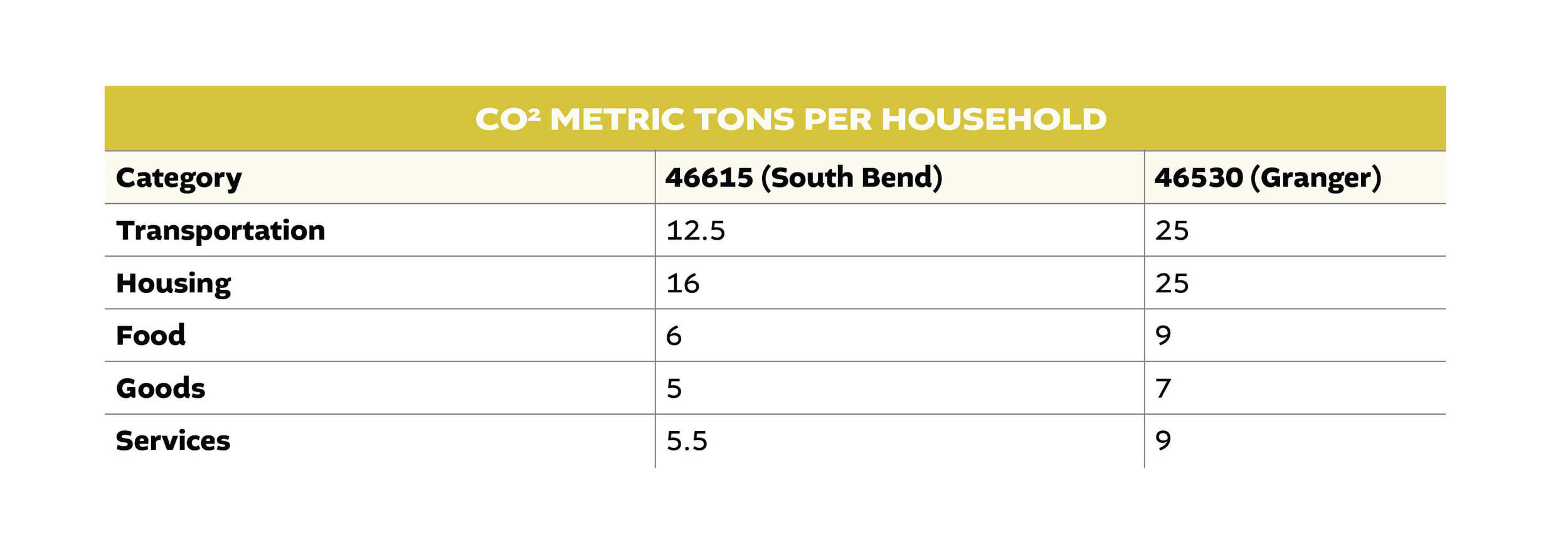
The only bright red zip code on the map is 46530, which neatly lines up with suburb Granger, Indiana. Granger households on average have twice as big a carbon footprint than households within downtown South Bend. The below chart compares the average South Bend household and the average unincorporated household.
On average, South Bend households only have 74% of the carbon footprint of households in suburban St. Joseph County. Is this simply a result of people in the suburbs being wealthier on average? Not exactly. For all zip codes in St. Joseph County, the food, goods, and services sectors of all zip codes are essentially flat. There are just slight differences between South Bend carbon output of food compared to Granger. The difference between city and suburb carbon output is mostly the difference in the transportation and housing categories.
For example, look at the difference between the South Bend zip code of 46615 – which is one of the wealthier zip codes within the South Bend city limits – and Granger’s 46530 zip code. 46615 nearly matches the South Bend CO2 average and consists of almost entirely single-family housing, just like 46530. Just remember South Bend’s downtown zip code has far smaller numbers than 46615.
While Granger has slightly higher CO2 footprints regarding food, goods, and services (which is most likely a result of the increase in wealth), the primary differences between the two zip codes are reflected in transportation and housing. Houses in Granger are almost exclusively large single-family homes on large suburban lots. These larger homes require more heating and cooling than smaller homes, which drives up CO2 emissions. Furthermore, these houses sit on subdivisions that are far away from the majority of the county’s job opportunities, and the lack of a connecting grid among their road networks necessitates longer drive times and a resulting rise in CO2 emissions.
It’s important to remember that in Part Four of More People we discussed how Granger had few jobs of its own compared to Mishawaka and South Bend, where most of the job opportunities in the county exist. Even if city residents live in single-family homes and drive every day to and from work, school, and stores/restaurants, they have a much smaller environmental impact than those residents living a similar type of life in the suburbs.
If we believe climate change is a real threat which needs to be addressed, we must address housing policy and the fact that living in large suburban housing is not sustainable.
If South Bend never lost 30,000 people and those families still lived in the city instead of the suburbs, that alone would result in 180,000 fewer metric tons of CO2 being released into the atmosphere every year.³ Depopulating our dense central cities and spreading our population over wider geographic areas leads to significant environmental consequences.
Cost: Increased Segregation
When the population shifted from South Bend to the larger St. Joseph County area, segregation increased at the county level. As previously noted in Part 2, during South Bend’s population decline beginning in 1960, the white population decreased due to “White Flight” while population of residents from every other race increased in the same time span. This has led to an even more segregated county than the one that existed in 1960.
In 1960, African Americans made up approximately 5.9% of the county’s population and 9.8% of the total population of South Bend. By the 2010 census, African Americans rose to 13% of the county’s total population and 27% of South Bend’s. As white residents left South Bend and the African American population grew, the difference between South Bend and the county became exacerbated. In 1960, South Bend had about 66% more African American residents compared to the county, today that percentage is closer to 110%. As the population of African Americans grew in St. Joseph County, many of them settled in South Bend at the same time white residents left the city.
While the African American population grew at a faster rate in the unincorporated portion of St. Joseph County than in South Bend, the beginning number was so small that the rate of increase outside the city being higher was almost inevitable. However, most notably, South Bend added nearly five times the number of African American residents in fifty years than the unincorporated county.
In terms of sheer numbers, white residents fled South Bend while the African American population rose, increasing the de facto segregation many Black residents today face. While St. Joseph County as a whole has become more diverse since 1960, the lion’s share of that diverse population has remained in the central city, while the growing suburbs have remained 91% white, compared to 61% for the city of South Bend.
Residential racial segregation has multitudes of negative consequences, primarily for the Black residents who are concentrated in a limited number of neighborhoods, such as lower housing quality, higher concentrations of poverty, and worse access to good jobs and education. As South Bend has become less white and more diverse over time, the stark contrast between the diverse city and the mostly white suburbs has only grown. This is a direct result of the type of population decline South Bend suffered.
Cost: Concentrated Poverty
This section will focus on the data between 1980 and 2010 as figures before 1980 regarding the number of people living below the poverty line were not available to me.
As South Bend shrank and the surrounding suburbs grew, South Bend’s overall share of the county’s population has continued to fall each decade. However, South Bend’s share of the county’s impoverished residents has only grown during that same time period. The chart below details South Bend’s share of the overall county population and the city’s share of residents beneath the poverty line.
In 1980, South Bend made up 45% of the county’s total population and 61% of the county’s total impoverished residents. By 2010, South Bend’s share of the total population dropped to 38%, but its share of impoverished residents rose to 65%. Even as South Bend lost thousands of residents, it managed to increase its share of St. Joseph County residents who were living under the poverty line.
Population decline has left the poorest residents concentrated in the central city of the county while the wealthiest have left.
Concentrated poverty leads to increased crime and violence within our community, which farther drives population decline. Just as above regarding school quality, population decline caused a detrimental cycle which further puts pressure on South Bend’s neighborhoods. These are the costs of population decline which affect South Bend residents every day. Studies have shown that those residents living not just in poverty but in poverty concentrated in small geographic spaces are linked to higher crime and delinquency, lower education outcomes, higher psychological distress, and various health problems.⁴
Keep in mind, South Bend has the highest paying jobs on average in St. Joseph County and South Bend subsidizes a number of institutions and services all county residents benefit from.The poorest amongst us are paying for the services all enjoy.
Population decline and migration within the county has left us with a poorer central city still charged with providing the jobs and amenities the entire county enjoys. This is unsustainable. When discussing the hard truths regarding population decline, we cannot forget that the large socioeconomic forces which led to population decline were due to policy choices made by federal, state, and local government officials.
. . .
This is the penultimate article in the More People series scheduled to be released in 2020. I’d like to thank everyone who has read the series thus far. This has been one of the most rewarding projects I have ever worked on and I appreciate all the wonderful feedback, questions, and disagreements which have been sent my way. Stories similar to South Bend’s can be found throughout the country and, even if you have no personal or professional connection to South Bend, I believe understanding what happened here is vital to understanding our country today.
The final part of the series will focus on what South Bend did right these past six decades and how South Bend avoided the fate of cities which were hit even harder. For even though South Bend did lose people over the past six decades, it managed to hang on to over 100,000 residents and 76% of its peak population. That, unfortunately, is not something all Rust Belt cities can say. Thank you for reading.


