More People: A Tale of Ten Cities

This is part of an article and podcast series by Joe Molnar titled More People: How South Bend Lost 50,000 People in 50 Years. Joe is a proud 4th generation son of South Bend.
Read the original series: Introduction | One | Two | Three | Four | Five | Six | Seven
Read the census recap: Introduction | One | Two
Subscribe to the podcast: Apple | Spotify | Google | Stitcher | TuneIn
When first contemplating this article, I thought I would focus on all of South Bend’s 35 census tracts. However, as seen below in the map, the tracts' story is illuminating but sometimes muddled by their sheer number. While it’s evident that most of the city saw growth, the small size of the individual tracts makes it difficult to analyze at a broader level. With this challenge in mind, I set out to divide the city into groupings of neighborhoods which would help us better understand the 2020 Census.
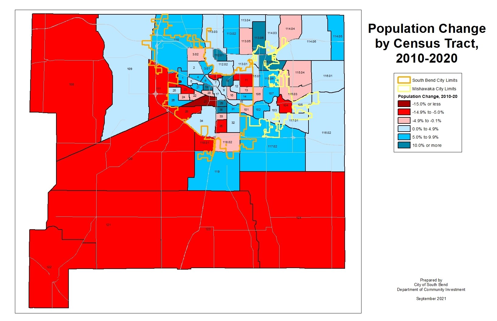
When speaking with newcomers to South Bend, one of their first remarks is the surprise that walking just a few blocks in one direction can feel like traveling to an entirely different city. The people of South Bend are proud and often parochial about their neighborhoods. Ask someone where Sunnymede ends and River Park begins or where the “real” West Side is, and you can find yourself in a fierce argument for which you certainly weren’t prepared. This was my challenge when picking the boundaries for these regions of the city.
There is no official map of neighborhoods in South Bend, so I’ve done my best to produce ten regions using census tracts as building blocks. These regions were established by combining similar neighborhoods and respecting natural boundaries, such as the river, and artificial boundaries, such as major streets. .
The map is not perfect, and I know others would have drawn the lines differently, but it serves the purpose of quickly identifying what happened in each section of the city.
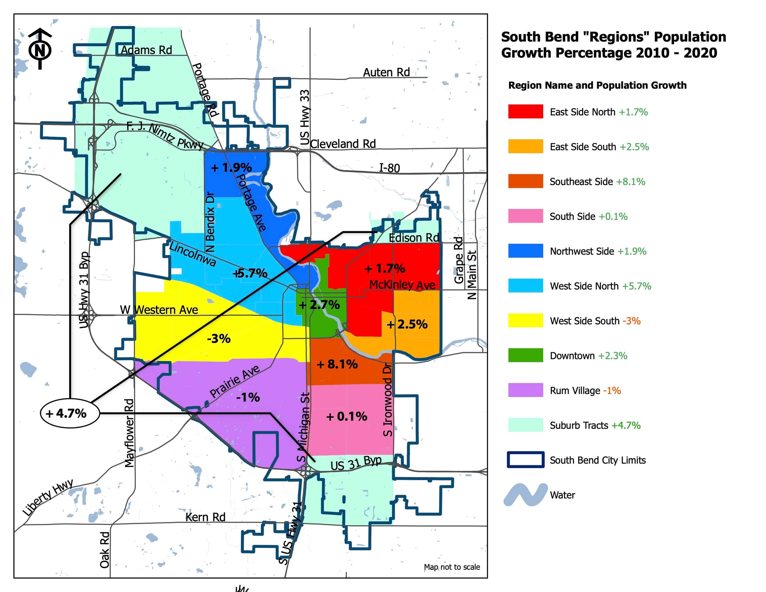
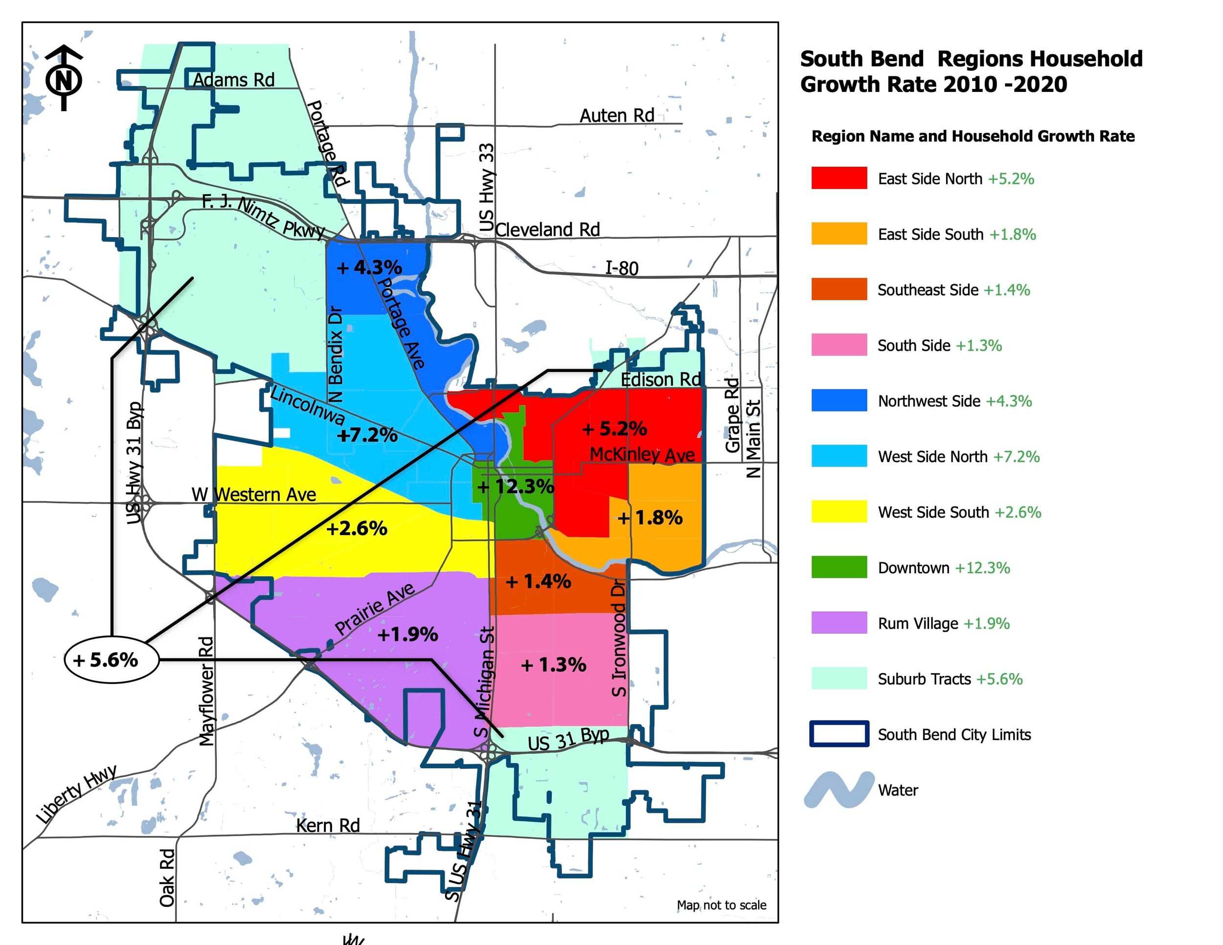
The above map shows the population growth rate of each region. The below map shows the household growth rate of each region. While the two maps relate, you can see some large discrepancies by comparing them.
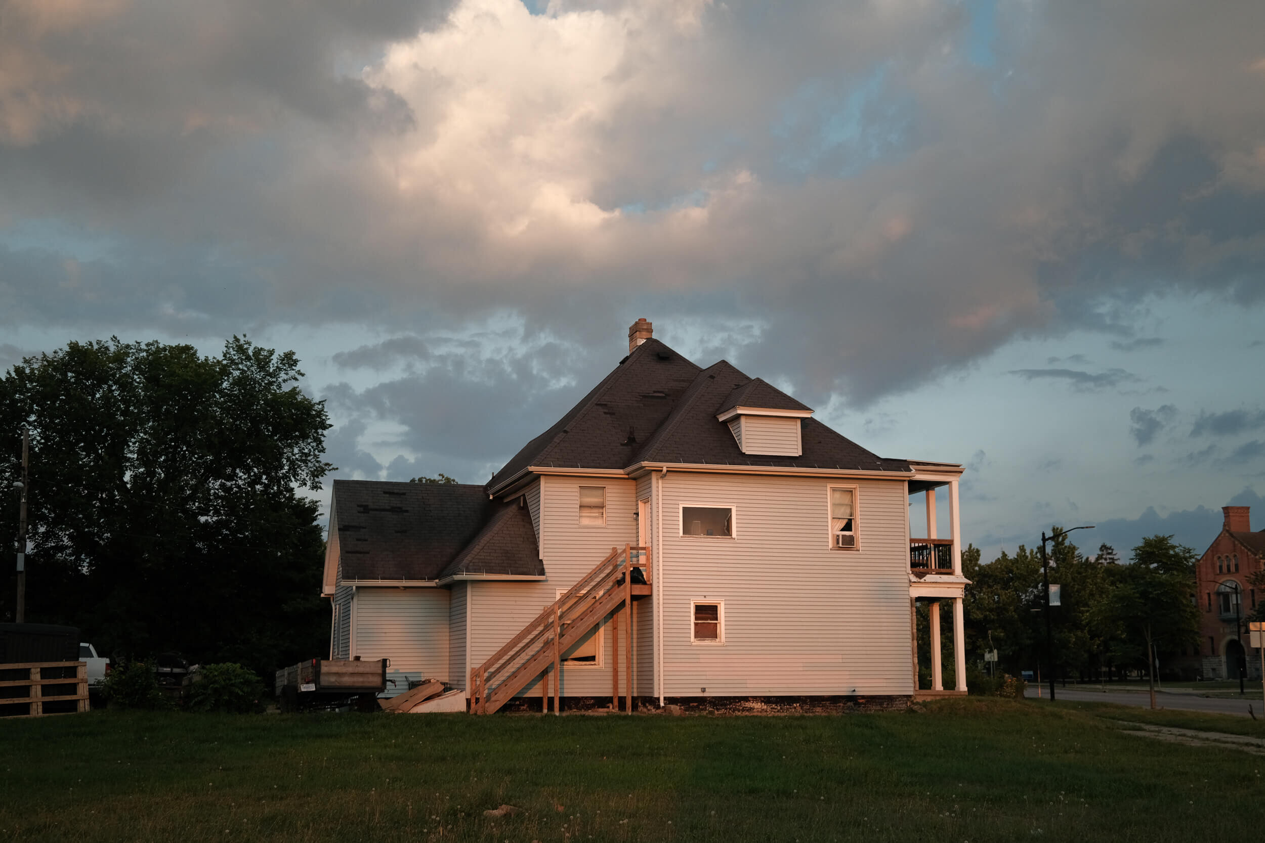
Residential growth in the urban core of South Bend in the East Bank neighborhood.
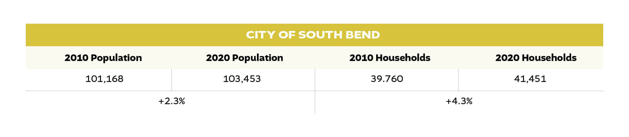
First things first: South Bend grew nearly everywhere! Eight of the ten regions grew in population, and all ten regions grew their number of households in the past decade. South Bend’s newfound growth is not a case of concentrated growth in one or two small parts of the city while everywhere else empties. The results paint a picture, not of a tale of two cities but a tale of ten distinct regions, all showing some type of growth. However, the way each region grew and the intensity of that growth varied significantly. Let’s take a look at each region individually. For reference, below is the population and household growth for the city.
Downtown
When South Bend's population growth was first announced, the immediate reaction was that a large portion of that growth would be downtown, both in the traditional downtown core west of the river, as well as in the growing East Bank neighborhood. This turns out to be only half true.
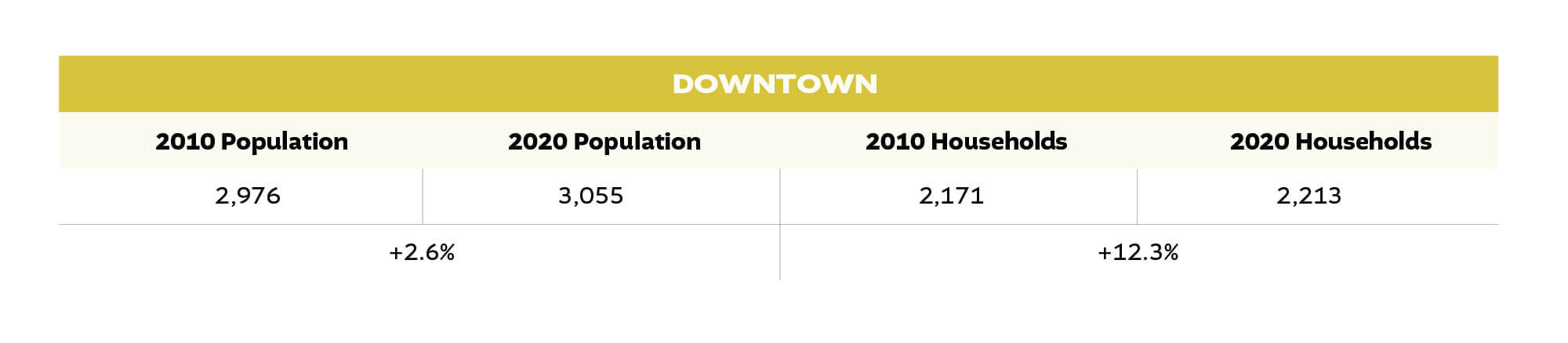
When looking at traditional population growth, downtown grew by 2.6%, which is just slightly higher than the City’s overall 2.3% growth. However, the number of households – or occupied housing units – grew by more than 12%, greatly exceeding the City’s 4.3% growth. Why the discrepancy? Because average household size shrank significantly downtown compared to the larger South Bend decline.
Many of the new households generated downtown were apartments, which typically have fewer residents per occupied unit than traditional single-family houses. It’s encouraging that growth has continued in the core of South Bend, but the small population of Downtown demonstrates that if South Bend wants to continue to grow, it will happen due to neighborhood growth in addition to new development Downtown. Many Downtown projects completed recently were not fully built out by the 2020 Census. If trends continue, Downtown will possibly see a larger rate of increase in both households and population by the time of the 2030 Census.
East Side North
East Side North is a term and geography that identifies the neighborhoods on the east side of the St. Joseph River, subtracting out the East Bank and River Park neighborhoods, which both have distinct geographies and identities.. This is another region of the city showing obvious signs of growth, especially along the Eddy Street and South Bend Avenue corridors. The Northeast Neighborhood centered on these two streets grew its population by 22%, but the rest of the region shows more modest growth.
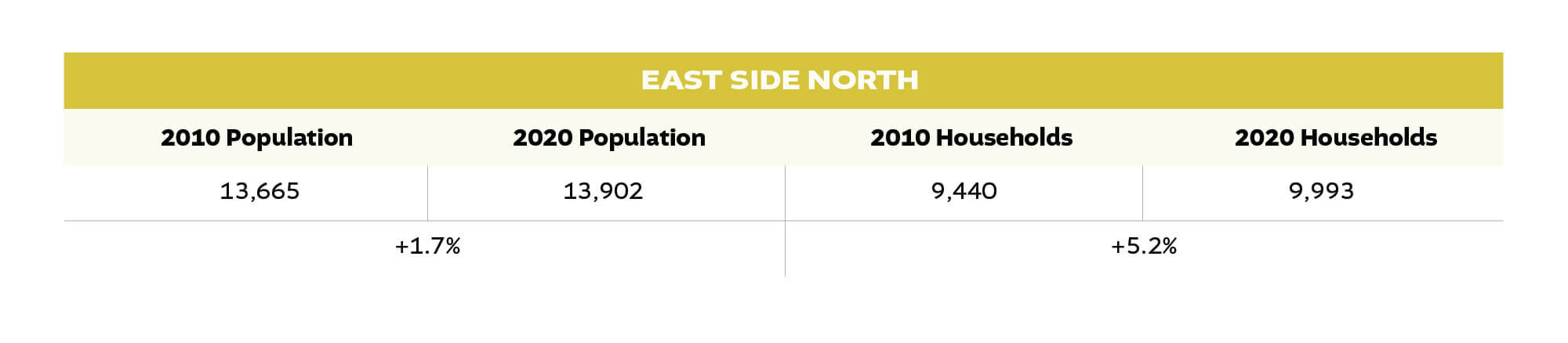
A new troubling development is a sharp drop in population in neighborhoods such as the North Shore Triangle and Edison Park, where a combination of shrinking household size and a loss of households led to relatively sharp population declines in both neighborhoods. This decline cancels out some of the gains closer to Notre Dame’s campus.
South Bend is no stranger to population decline through a decline in average family size, nor is it a stranger to losing households in its core neighborhoods. The phenomenon occurring in neighborhoods like the North Shore Triangle is a new variation of population decline the city has yet to see before.
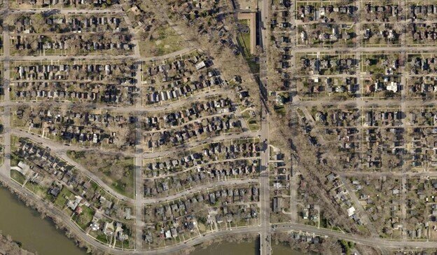
North Shore Triangle Neighborhood and Harter Heights Neighborhood centered on Michigan Street north of the St. Joseph River.
Houses of North Shore Triangle and Harter Heights are some of the most expensive and desired in South Bend. Good early 1900s housing stock combined with excellent proximity to Notre Dame, Downtown, and multiple parks and trails has led to this. Despite all this, the neighborhoods lost 10% of their population and 5% of their households. How is that possible?
Like the city, the average family size dropped, explaining much of the decline in areas like Edison Park. But what makes Harter Heights and the North Shore Triangle unique is the significant decline in the number of households as well. This area saw the largest drop in households in the entire city. One of the premier neighborhoods of South Bend is emptying slowly by the dual phenomenon of houses being purchased primarily for short-term rentals and being left vacant for most of the year as second vacation homes.
East Side North as a region is one of the most promising in terms of potential growth heading into the 2020s; however, the emergence of “zombie neighborhoods” or neighborhoods where the houses are still maintained but no one lives in them, is something which will continue to hamper population growth if the market does not provide enough housing to meet the demands of residents looking to live there full time, short term rentals, and vacation homes. More housing units added to this region will help combat zombification.
East Side South
This region comprises the River Park neighborhood and areas just north of Jefferson Boulevard containing large apartment complexes. The housing crash of the 2000s significantly impacted River Park, and it saw a significant drop in population during that time. The neighborhood bounced back this decade.
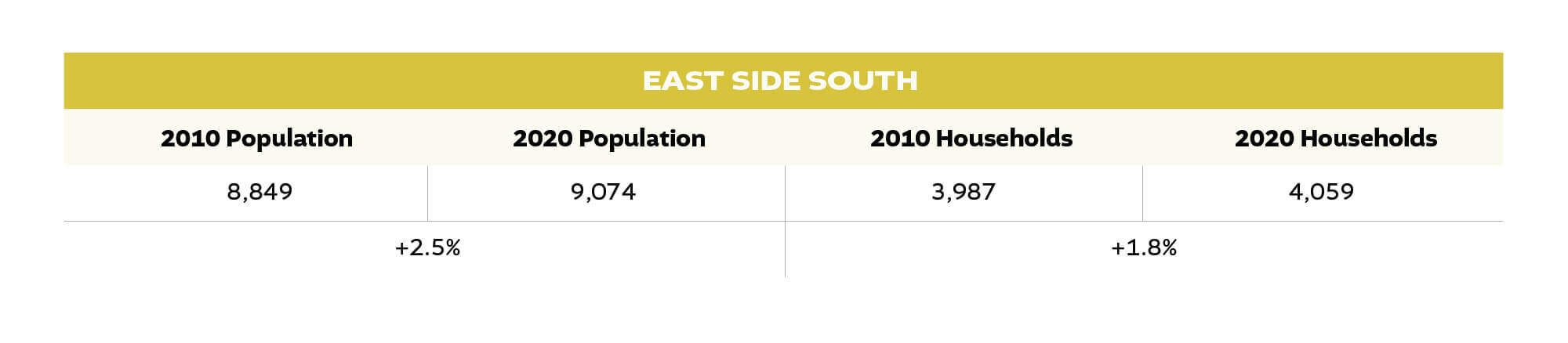
After the housing crash left thousands of vacant houses throughout South Bend, there was the opportunity for some of those houses to be reoccupied. This reoccupation of formerly vacant housing stock happened throughout many of South Bend’s neighborhoods. While none returned to their 2000 population, many bounced back from the 2010 low by a significant margin. Census Tract 14 – the area north of Mishawaka Avenue, west of Logan Street, south of Jefferson Boulevard, and west of Ironwood Drive – grew by 8.5% without building any significant number of new housing units. Interestingly enough, this region saw their household size increase, slightly bucking the national and local trend of smaller families. We will see this bounce-back in many of the regions below.
Southeast Side
The Southeast neighborhoods are some of the hardest-hit areas for population decline. The area’s population dropped from 13,845 people in 1960 to just 6,520 in 2010. More People explored in detail why this happened, and it doesn’t need repeating here, but keep that 1960 population number in mind when thinking about the growth which occurred this past decade.
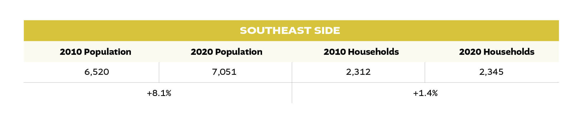
For the first time since at least the 1950s, if not longer, the population of Southeast neighborhoods increased by a large amount (over 8%). The neighborhoods west of Miami Street grew at an even faster pace. Hopefully, this signals an end to close to a century of downward spiraling disinvestment in these neighborhoods. This story repeats in some Westside neighborhoods as well.
Just like in River Park, the 2000s housing crash was so detrimental to these neighborhoods that it left a significant number of vacant houses sitting for a long time. While many houses on the Southeast Side were demolished, either by individual owners or by the City during the 1000s Houses in a 1000 Days program, many others have been rehabilitated. With organizations like 466 Works, the Southeast is in a position to continue building new housing in the neighborhood and stabilizing the existing housing stock.
South Side
This region makes up the heart of the “old South Side” or the neighborhoods in between Ewing Avenue and Ireland Road.
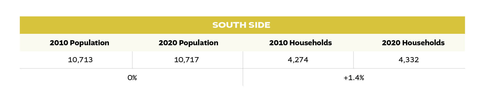
Here we see a familiar South Bend story: the number of households increases, but the population does not keep up. However, in a Rust Belt city like ours, even just holding population steady is an achievement and the South Side’s stability is something to appreciate against recent decades of decline. This region – specifically the Twyckenham Hills Neighborhood – has seen recent growth in the influx of Orthodox Jewish residents who have been migrating to the area. This stability and influx of diverse residents has kept the South Side stable.
The neighborhoods of Erskine Park and Twyckenham Hills have proven to be a stable asset for the City.
Rum Village
There was some debate if the Rum Village neighborhood should be combined with the West Side South region or left to itself. While the smallest of the regions outside of Downtown in terms of population, it is separated enough from both the Southeast region and the West Side South region that it only really fits as its own entity.
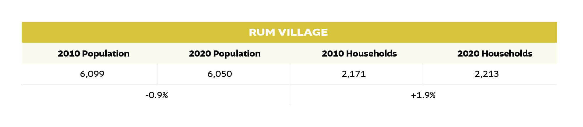
This is our first region to show population decline, but there is a bright lining that the number of households saw reasonable growth of 1.9%. If this household growth can continue at this pace in the coming decades, the neighborhood should remain stable even if the population drops slightly. The establishment of the Four Winds Casino South Bend on the southwest portion of the neighborhood may spur growth along the now heavier traveled S.R. 23.
West Side South
There was considerable debate on how to divide – or if you should at all – the West Side into separate regions. West Side South is essentially the neighborhoods on either side of Sample Street and Western Avenue and bordered by industrial uses north and south that separate it from the West Side neighborhoods to the north and Rum Village to the south.
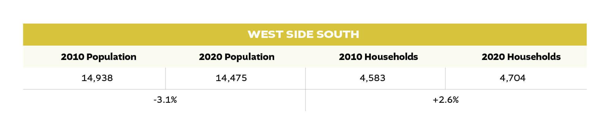
Here we see another case of declining population coupled with an increase in the number of households. This region also contains Census Tract 27, which complicates the numbers further. Tract 27 contains the St. Joseph County Jail in its population. The official day of the Census was April 1, 2020—a time when the Covid-19 Pandemic was reducing the incarcerated population. The City’s Institutionalized Population in Group Quarters dropped by over 400 residents. This drop occurred almost entirely in Census Tract 27. Without that drop, the West Side South region would have seen its population decline by less than 1%, matching the Rum Village region.
Another part of the puzzle for the West Side South is its concentration of Hispanic residents, who are a majority in some of the region's tracts. Hispanic households – who have average household sizes larger than non-Hispanic residents – are seeing rapid shrinkage in average household size. This will put downward pressure on the population number even though the number of households is growing.
West Side North
As mentioned above, the debate over where to draw the lines on West Side regions can be contentious. We included all the neighborhoods which bound Lincoln Way West in the West Side North region.
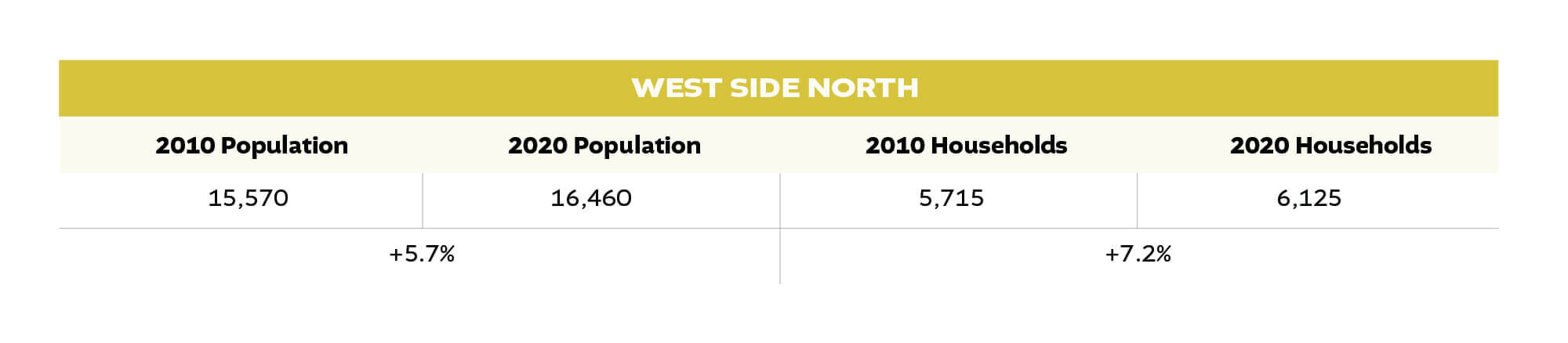
This portion of the West Side grew sharply during the 2010s with a gain of 890 residents—the largest total number in the city. These neighborhoods – such as Kennedy Park and the City Cemetery Neighborhood – had seen some of the largest population declines since 1960. This is the first time in 60 years, perhaps longer, that many of these neighborhoods grew in population. This growth is even more impressive as the average family size continues to drop.
The Greater Kennedy Park neighborhood grew its population for the first time in at least 60 years if not longer.
This region was also the epicenter of the 1000 Houses program. In the tracts that made up the bulk of the program – all in the West Side North region – the number of vacant houses fell by 797, while the number of total houses fell by 430. This means that 46% of the reduction in vacant housing in this region was due to previously vacant housing becoming re-occupied.
Essentially what we saw in the West Side North region and the Southeast was pretty simple and is easy to explain in an example. Take a basic block that has ten houses on it. In 2010, the block had five occupied houses and five vacant houses. In 2020, the block now has seven occupied houses, one vacant house, and two vacant lots. The block saw a significant increase in the number of households even as its total number of housing units dropped. From a casual observation perspective, the neighborhood has emptied even as the population has increased.
With the reduction in vacant housing in the region, moving forward, it will be important to see if the population continues to rebound at its fast pace or if it levels out. Adaptive reuse of large sites such as the former Marquette School and other large sites could also help boost the region’s population even further.
Northwest Side
When we established the regions in this piece, we combined this region with West Side North. After discussing with several individuals who live in the area, it was clear that many people see Portage Avenue as a sort of transition between the two regions. This region encompasses all of the neighborhoods north and east of Portage Avenue. It also includes the neighborhoods on both sides of Portage Avenue, north of Lathrop Street.
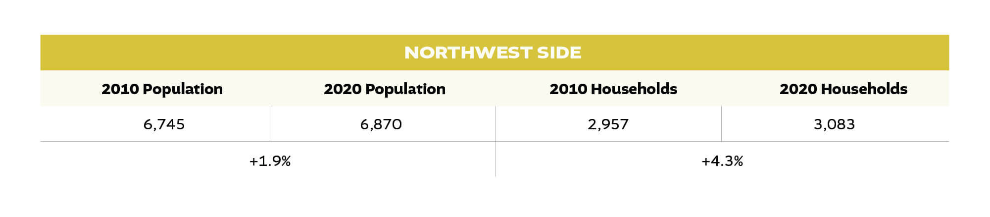
The story is like what we saw in River Park, where stable neighborhoods which saw an increase in vacancy during the 2000s bounce back this decade by occupying once-vacant houses. This region also contains the north half of the Near Northwest Neighborhood, where the NNN, Inc. has steadily rehabilitated or constructed housing.
This bounce-back and rise in population in some of the more stable neighborhoods throughout South Bend is an encouraging sign that the decades-long population decline may be over.
Suburban City Limits (Post-1960 Neighborhoods)
This last region is the only one that is not contiguous. All of the city neighborhoods south of Ireland Road and north of the airport are a part of this region. Neighborhoods that the City annexed after 1960 do not fall neatly into full census tracts; but rather exist in census tracts shared with the county, making the analysis more difficult—but not impossible.
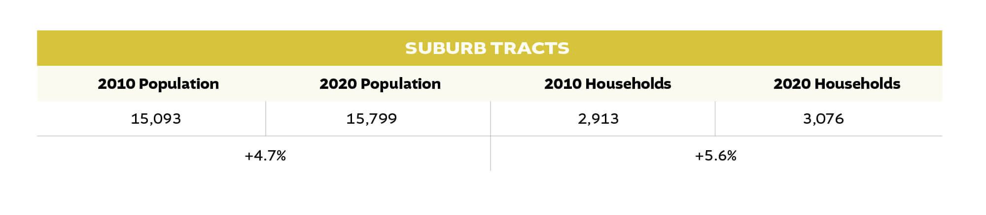
The suburban city neighborhoods did grow faster than the pre-1960 neighborhoods but not by a drastic amount. One point to highlight is that these areas saw relatively little annexation in the 2010s, meaning that the 4.7% population growth came primarily through finishing out subdivisions that had stalled during the housing crash. This suburban infill helps pay for the infrastructure already built, sometimes decades ago, for these subdivisions.
Looking ahead, if the City continues to annex land rarely for new residential subdivisions, it will be interesting to see if this geography continues its steady infill growth or if, like other neighborhoods, it becomes a victim of family size decline.
Putting It All Together
Looking at all regions together, you get a similar picture as laid out in the previous article breaking down the 2020 Census results. The population grew somewhat evenly across the city, and the number of households bounced back faster than the overall population. Some of our regions, such as the Southeast and West Side North, had very similar decades while others, such as East Side North and South Side, had unique trajectories.
Some of the most encouraging aspects of the 2020 Census are comparing South Bend to other Rust Belt and Midwestern cities. South Bend’s growth is an outlier for these cities, and its broad-based growth across many neighborhoods is even more so. For example, Chicago – vastly larger than South Bend but still a midwestern legacy city – experienced a similar overall growth rate as South Bend. However, its growth was primarily concentrated along the coast of Lake Michigan, while inland neighborhoods mostly shrank. Compare this to South Bend where our Downtown did grow and so did our “hot” neighborhoods near Notre Dame, but so did nearly all other neighborhoods.
…
Our final article detailing the newest Census data will dive into the changing demographic makeup of the city, exploring upcoming opportunities and worrying trends facing the city in the 2020s. In general, South Bend is becoming a more diverse and less White city. While this matches our nation, the trends are coming earlier to South Bend.
A big thanks to both Michael Divita again for helping compile most of the data found in the series and Andrew Netter for developing the maps.
Read recent posts